Food consumption is a very central part of human lives, by analyzing food habits we can deduce a large panel of health conditions and human behaviors. The Tesco Paper analysis focused on describing their methodology and results about Obesity and Diabetes prevalence. Throughout this data story, we will explore different aspects of the dataset by looking at the Obesity problem using the food categories first. We will then visualize the geographic repartition of food categories. Finally, we will analyze the link between food consumption and the Income per Area.
I - Introduction to the Tesco paper
In this first part, we’ll give to the young padawans an overview of the paper Tesco Grocery 1.0, a large-scale dataset of grocery purchases in London. This paper was made by some experimented Jedi that used this dataset wisely. We tried to follow their path by extending the paper, as explained in the other blog posts.
The Tesco Grocery 1.0 dataset is a record of over 420 M food items, purchased by 1.6M fidelity card owners across Greater London. The authors aggregated the data at different levels, using the same geographical delimitations as the Office for National statistics, dividing it into different granularities: LSOA (Lower Super Output Area), MSOA (Medium Super Output Area), Ward, and borough. They computed the average food product for each area and linked it to health outcomes strongly linked to the food consumption dataset. Then, they established a correlation between the food consumed and the prevalence of health diseases in an area.
Data aggregation
We can divide the aggregation of the Tesco dataset into two main parts.
A link between the product and its nutrition properties
The first aggregation scheme happened for each of the 420 M food items entry. Each entry was under the form {customer area, GTIN, timestamp}. The GTIN (Global Trade Item Number) is used by companies to uniquely identify their trade items globally. The authors joined each entry with its corresponding nutrition informations, such as {total energy, net weight, fats, saturated fats, carbohydrates, free sugars, proteins, fibers}, on top of volume and relative volume of alcohol for drinks.
Then, they computed different data related to the nutrients informations, such as the total energy in kilocalories (kcal), as the dataset provides the amount of nutrients in grams (g). As each nutrients has a fix g / kcal ratio, the authors were able to compute the total amount of energy, as well as the relative amount of energy related to each nutrients.
On top of this, each food item is associated to one category. The categorization includes 17 non-overlapping classes, available in the Appendices.
An aggregation between food purchase and geographical areas
The authors mapped the purchases to geographical areas, as mentioned in the introduction. This aggregation scheme happened for all geographical levels, from LSOA to Borough. This aggregation scheme allowed the authors to have multiple granularity levels, which enable a wider range of studies that might benefit from having either a high number of smaller areas containing fewer datapoints or a lower number of areas characterized by more robust statistics.
Those areas have basic census statistics collected by the ONS in 2015. An exhaustive list of these statistics present in the joined dataset is available in the Appendices. The authors aggregated the Tesco data relative to each area and provided 3 different sets of variables.
The first group of variables expresses the Tesco penetration in an area. The representativeness, which is the ratio between the number of customers in an area and the population, is computed. Normalized representativeness is also computed.
Then, the authors decided to compute the average product bought for each area. They computed multiple nutritional properties about this average product, such as the weight or the volume, the energy, the energy - density, and the grams of each individual nutrient $nutrients_{i}$. Then, they compute the energy per nutrient, as well as the frequency of each nutrients, and the frequency of energy per nutrient. They managed to compute the entropy of these 2 frequencies. More details of the formulas in the Appendices.
The last group of variables is about the Product categories. The authors computed the probability distribution of items belonging to the 17 different product categories being purchased in an area a and the entropy of that distribution. They also computed the relative weight of products belonging to any category compared to the total weight and its entropy.
Data biases and limitations
Several limitations were pointed by the authors:
- Representativeness: As this study collects the grocery purchases from Tesco’s customers owning a Clubcard submission, this set of Clubcard owners might not be representative of the overall population.
- Coverage: The concentration of Tesco is higher in the northern part of London, thus some areas have a low penetration rate.
- Limited scope: This dataset only shows the grocery purchases at Tesco - thus, the food consumption in restaurants or the food bought at other grocery stores is not included in the dataset.
- Average product As the data is aggregated to create the average product consumed in an area, this is a limitation to any study that requires an average representation at an individual level rather than at a geographical level.
Technical validation
The authors wanted to show that their aggregated dataset made sense. After a quick explanation on how to select the most representative areas, they linked their created dataset to food-related health outcomes.
Area representativeness
To ensure the representativeness of the dataset, the authors stated that we can play with the normalized representativeness in order to select the areas with the best ratio between the number of customers and the numbers of residents.
Validation of health outcomes
The authors joined this Tesco dataset to dataset related to obesity and Type-2 diabetes, as these health diseases are strongly correlated with diet.
The authors computed the Spearman rank correlation between the energy, the nutrients and the nutrients entropy of the average product in an area and the prevalence of obese and overweight children and adults, as well as diabetes prevalence. Those results are displayed below. We should note that only statistically significant correlations (p < 0.05) are shown.
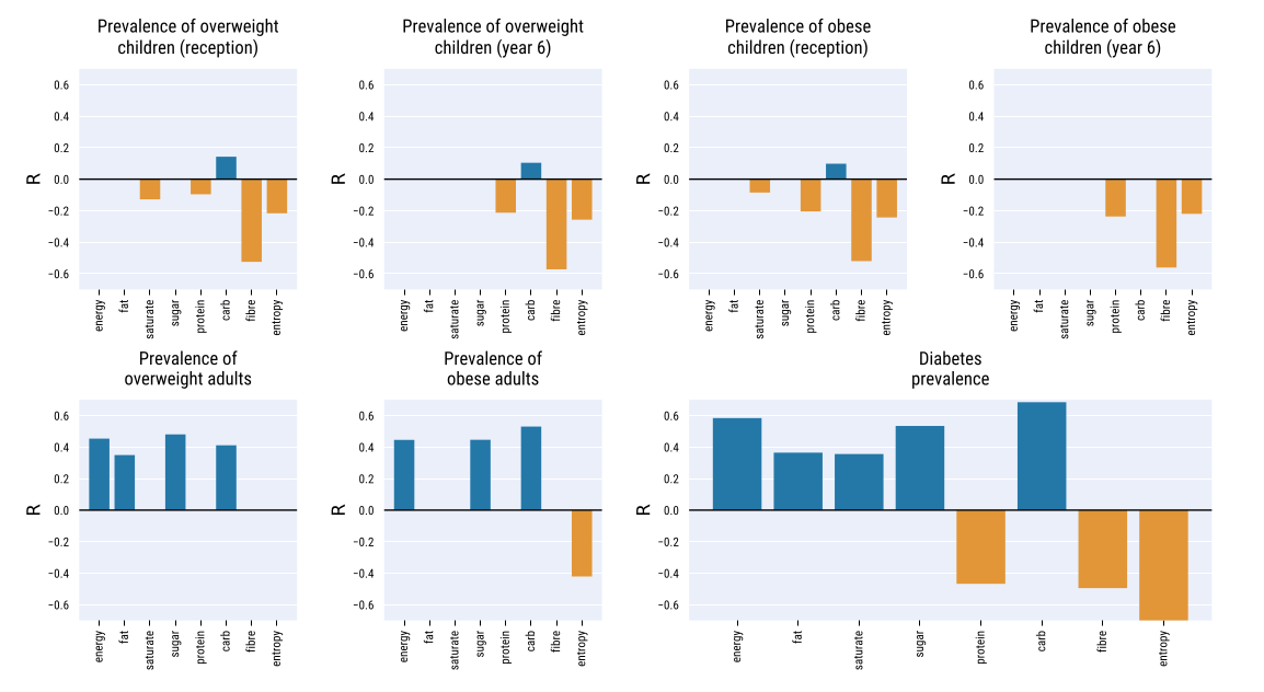
To build stronger evidence of the link between the dataset and food-related illnesses - thus, to show that the food descriptors provided dataset are not proxies, the authors then ran an ordinary least square regression.
Using the two highest-correlated factors and four control variables accounting for demographics, they managed to get an R² ratio of 0.613, which denotes high goodness of fit. Using only the two factors energy-carbs and $H_{_energy-nutrients}$, the R² ratio remained high (0.56)
These result showed that the dataset makes sense, as they found correlations which were expected between the average food product and related health diseases.
For more details about the Paper and the Data itself, the reader is invited to refer directly to the paper.
Now that we summarized the paper, we can present the goal of our extension and analysis. Our first goal is to dig deeper into the analysis of the Children Obesity dataset already presented in the paper.
We will then geographically visualize the different food type consumption in London and then analyze the link with the Mean Income by area. With this we want to be able to see if given a shopping basket, we can to predict the Income of the shopper.
II - Children overweight prevalence
In the first part of our extension, we wanted to explore more in-depth the Tesco Grocery dataset, and especially the link between food and children overweight prevalence.
We wanted to explore deeper the papaer and establish a stronger correlation between children’s overweight prevalence and food consumption. Indeed, we firstly thought that obesity among children and grocery shopping were strongly correlated.
Introduction and expectations
We decided to explore this part of the paper as we thought that the paper didn’t go in-depth enough. Indeed, the paper focused on how the authors aggregated the data rather than on establishing strong links between childhood obesity and grocery shopping. The authors computed the Spearman correlation between obese and overweight children at reception (4-5 y.o) and 6 y.o, and food consumption estimators (energy, nutrients, nutrients entropy).
Our goal was thus to find correct predictors to produce a machine learning model that would be able to estimate overweight prevalence, given the information of an area. As we had multiple machine learning models at our disposal and more than 200 potential predictors, we thought that we could find a machine learning model that would predict the values correctly.
Our first ML benchmarking
Choice of our predictors and target
After joining the grocery dataset with the children obesity one on the area_id, we obtained a DataFrame with 202 potential predictors and 7 labels for only 544 data points.
We had to select the correct predictors and the correct target. Indeed, our model will surely overfit with 202 predictors for a sample of size 544, and we have to focus on one target value.
The data for overweight children is more sparse than the one for obese children. Indeed, obese children are included in the overweight ones, so the overweight prevalence for children will always be greater than the obesity prevalence in the same area. That’s why we chose to use overweight children as our predictor. We now had to choose between reception (4-5 y.o. children) and 6 y.o. children. We chose to select 6 y.o. children data, as they have had more time to eat and to have weight changes because of their food consumption.
As the dataset is based in London, we decided to follow the guidelines of the National Health Service to select our predictors.
We analyzed these guidelines and discovered that there were 4 main columns we can extract from the dataset that is potential cause to obesity: calories, fat, sugar, and alcohol. As children of 6 years old are not likely to drink alcohol, we will focus on the 3 columns fat, sugar and energy_tot.
Data preprocessing
We had to sanitize our data and preprocess it. We removed NA values, and standardize our input. We then splitthe data into a train set and a test set.
Machine Learning Models
Our predictors, as well as our label target, are float numbers. Thus, it was a supervised Regression problem: we decided to benchmark our predictors on various ML algorithms related to the supervised regression problems. Those models are:
- Linear regression
- Ridge model
- Support Vector Machine (SVM)
- Tree
- Gradient Boosted Regression (GBR)
- ADABoost
We decided to benchmark on different models to keep the model scoring the best, and to use the R² score to compare the different models.
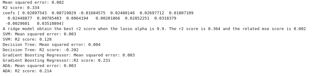
Result
Surprisingly, our results for this ML model were not good.
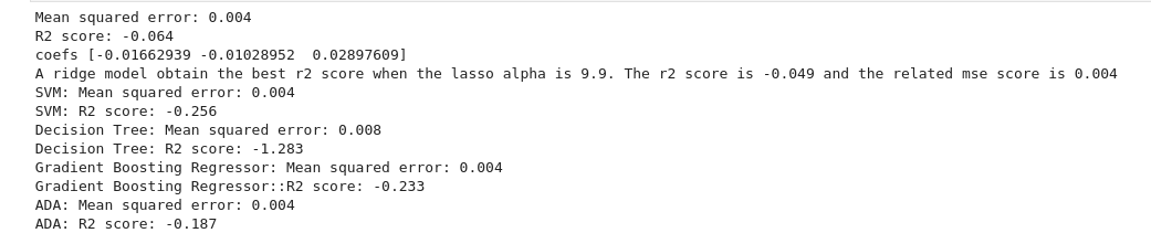
We can see that the R² score is always negative, which means that our models have a worst prediction than if we stated that the target value for all of our test data was always the mean of the target values. Thus, our machine learning models predict poorly the target.
Trying out with different predictors
New predictors, same pipeline
We tried to stick with the NHS guidelines about obesity. This time, we decided to stick with the relative amount of energy for fat and sugar instead of their absolute values in the average product. It might produce different results, and we wanted to test it out.
Our predictors for this model are f_energy_sugar, f_energy_fat and energy_tot. We decided to stick with the same target, overweight prevalence for 6 y.o. children.
After sanitizing, standardizing, and splitting the data into train and test sets, we applied our ML algorithms to it.
Results and analysis
Again, our ML models predict poorly the target, as they all have a negative R² score.
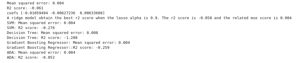
But why do we have bad results while we follow NHS guidelines? Does that mean that we did something wrong?
We tried to analyze our result and explain why we didn’t find any machine learning model fitting our data.
- NHS warns about the number of calories eaten for obesity, but not for type-2 diabetes. It is because gaining weight is due to having more calories ingested than burnt. Thus, lacking some physical activity data might be more damageable for our study, as it is paramount in obesity analysis.
- We have the average product for each area, but we don’t know how much “average product” will be eaten by the children. As gaining weight is a matter of calories ingested, it is crucial information that we lack.
- We analyze children’s overweight prevalence but our data is the average product bought at Tesco. On top of the limitations pointed out in the Tesco paper (TODO: add a link to the tesco presentation blog, limitation section), we can add that we don’t know if the children eat differently than their parents.
- When babies are born, some of them weigh higher than others. It is a natural condition, that is “beaten” by one’s diet and physical activity over time. However, by capturing overweight children prevalence at 6 y.o., maybe the children haven’t lived long enough to have their eating habits changed significantly their weight.
Using food categories
We continued to work on this dataset and we wanted to try out using food categories proportions to have a correct ML model. As we decided to focus on those food categories for the other part of our extension, it made sense to use them in this project.
After the usual data processing and splitting, we found these results:
With positive R², we have done better with this third ML model than with the 2 previous ones. We decided to perform an ordinary least squares statistical analysis. After discarding the non statistically significant product categories, we plotted the result with the 95% confidence interval.
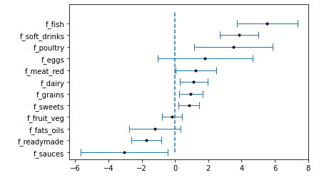
These results were quite surprising. Even though it makes sense for some food categories, for example, the soft drinks, other results are in contradiction with standard food advice. For example, we find that the highest correlated food category is fish.
Instead of overinterpreting these results, we wanted to use them to give a warning about data analysis in general. It is important for a data scientist to not try to find meaning when there’s none, as one can always find meaning if he desires. We’ll encourage young padawans to try out the Spurious correlations website for examples.
In our case, even though we have statistically significant correlations between food categories and children’s overweight prevalence, we don’t want to state that one causes another, as we don’t agree with it.
We also learnt that our intuition about correlation might be wrong sometimes. We thought that obesity among children and grocery shopping was correlated, but it was not the case.
As we saw that food categories are more impactful than we thought, and that the paper haven’t used at all the food categories, we decided to explore this part of the dataset more in depth. We will continue by visualizing the proportion of purchases for each category across London’s areas.
III - Geographical Visualization
As presented in the previous parts, we have at our disposal a huge dataset containing the food purchases made in the Tesco shops within the boundaries of London. Faced with all this data, we are a little lost and ask ourselves where to begin. And suddenly we remember that we learned, during our Padawan formation, how to become a data wizard. We take out our most beautiful tools and begin to make some visualizations to understand better our data.
We have many features available for purchases. We notice that the Tesco paper did not deeply explore the different food categories. Therefore, we decide to focus on these.
What we want to visualize
We wonder if the Tesco consumers buy the same products and in the same quantity all over the city. In particular, we wonder :
- Are there some food categories that are preferred in certain regions?
- Are there some others that are equally bought in the city?
- Can we draw a pattern from this visualization?
To try to answer all these questions, we make plots of the distribution of a certain food category all over London. We consider a mean of the fraction of purchase of each food category in a given ward.
Visualizations
Each plot below represents the mean proportion of purchase of a certain food category per ward. To see all the plots, you can click on this link. On top of that, by moving your mouse all over the map you can discover the exact mean proportion of purchase of a certain food category, the mean income, and the median income in each ward.